Designing an Inclusive Giving Website for Knowbility
I recently had the pleasure of working on the design for the Knowbility Giving website, a project that underscores the importance of accessibility and inclusivity in digital spaces. The design process was both collaborative and fulfilling, involving close cooperation with the Knowbility team and leveraging the powerful design capabilities of Figma.

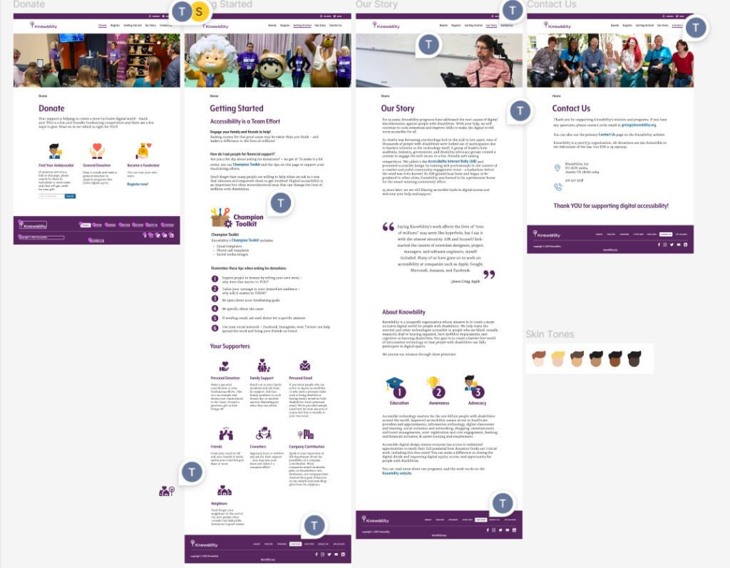
Knowbility Giving website design in Figma
Focus on Accessibility
From the outset, accessibility was a primary focus. Every aspect of the design, from wireframes to final touches, was crafted with inclusivity in mind. Key accessibility features included:
- Tab and Reading Order: We meticulously organized the tab and reading order within the wireframes to ensure a seamless experience for users navigating the site via keyboard or screen readers.
- Custom Icons: To visually represent diversity and inclusivity, we designed custom icons featuring guide dogs, individuals in wheelchairs, and the Knowbility Giving Tree.
- Skin Tone Diversity: We included icons with different skin tone options to reflect a broad spectrum of human diversity. The skin tone labels used were: Light, Fair, Medium, Olive, Dark, and Deep, ensuring respectful and inclusive representation.

Image shows the website footer with the tab order overlay

Image shows several custom designed icons showing guide dogs and people in wheelchairs and the Knowbility giving tree from the Knowbility logo

Custom icons with different skin tone options for diversity in iconography
Collaborative Design in Figma
The entire design process was executed in Figma, a tool that facilitated real-time collaboration with the Knowbility team. This collaborative approach ensured that every stakeholder’s feedback was incorporated, resulting in a well-rounded and user-centered design.
Figma’s features allowed us to:
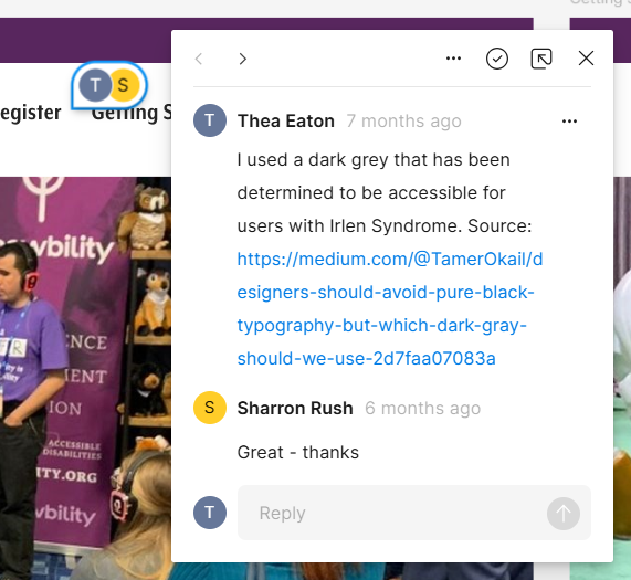
- Collaborate in Real-Time: Team members could make suggestions, leave comments, and see updates instantly, which streamlined our workflow and enhanced the design’s effectiveness.
- Maintain Consistency: We used Figma’s design systems to keep the visual elements consistent and aligned with Knowbility’s brand identity.

Image shows a Figma collaborative comment
Final Thoughts
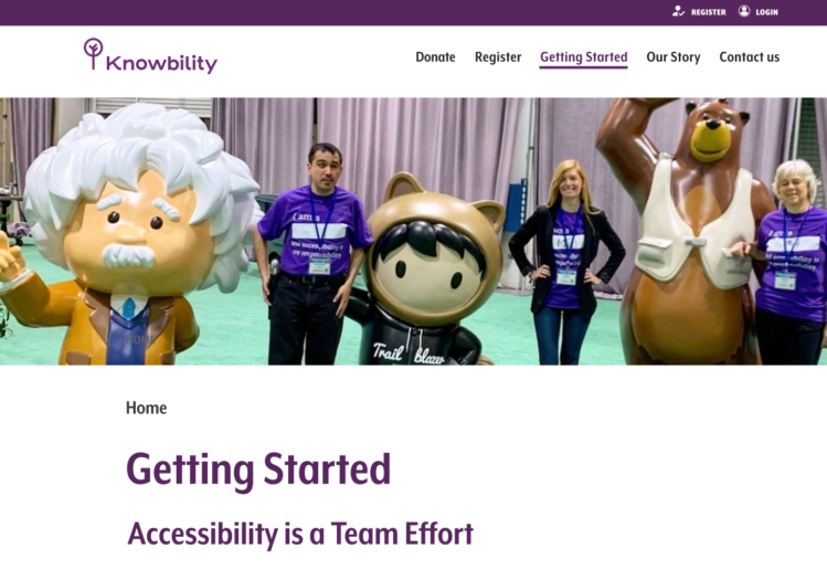
Designing the Knowbility Giving website was a rewarding experience that highlighted the importance of accessible design practices. By focusing on accessibility and inclusivity, we created a digital space that welcomes and supports all users. The collaborative nature of the project, combined with the capabilities of Figma, allowed us to produce a design that truly reflects Knowbility’s mission to promote digital inclusivity.
Visit the Knowbility Giving website to see the design in action and learn more about their incredible work in advancing digital accessibility. (New design still under construction)

